UC Berkeley Web Feature
 |
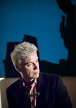
How did I get here? Former Talking Head David Byrne steps out from behind the podium to explain an Edward Tufte chart. (Bart Nagel photos) |
David Byrne really does ♥ PowerPoint, Berkeley presentation shows
BERKELEY – "Hello. My name is David Byrne, and I'm going to do an introduction to PowerPoint."
The roar of applause and cheers that greeted this deadpan statement was undoubtedly the most enthusiasm ever exhibited before a lecture held in UC Berkeley's Dwinelle Hall. Byrne, best known as the front man for the Talking Heads, proceeded to do exactly what he said he would. But while he poked fun at the popular Microsoft presentation software's bullet-point tyranny and Autocontent Wizard inanity, Byrne also defended its appeal as more than just a business tool — as a medium for art and theater. His talk was titled "I ♥ PowerPoint," and he confessed that he loves the program not in spite of, but in some ways because of, its shortcomings.
 Byrne waits for his turn at the laptop. |
This must be the place
"PowerPoint is the Rodney Dangerfield of software: it gets no respect," summarized Ken Goldberg, the Berkeley engineering professor and artist who invited Byrne to speak as part of the Art, Technology, and Culture Colloquium series he started in 1997. "It's easy to ridicule it for its corporate nature, but the real story is about how participatory and democratic it is. High school kids use it, rabbis use it, people even use it for wedding toasts."
Byrne discovered the software a few years ago and, excited by how easy it was to integrate visuals and music, began to create art pieces with it. He collected them into a book, "Envisioning Emotional Epistemological Information," which came with a DVD of about 20 minutes of his "PowerPointillism," as Goldberg calls it. Those slides - among them images of Dolly the cloned sheep, simple drawings, and arrows jostling each other like a confused school of fish (below right) - cycled across the screen before the lecture began.
 Still slide from Byrne's "Envisioning Emotional Epistemological Information" book, part of the pre-show. |
The crowd settled down quickly when Byrne emerged, perching on the edge of the stage as Goldberg introduced him as "the Renaissance man of rock & roll." In addition to the Byrne's successful solo career post-Talking Heads, he has written an Oscar-winning soundtrack ("The Last Emperor"), had multiple solo art shows, and been instrumental in bringing African and Latin American music to a wider audience.
Goldberg's preamble was in the form, of course, of a PowerPoint presentation: one with snapshots of businesspeople in offices. They turned out to be 1980s photos of the original team who created PowerPoint, led by Berkeley alumnus Bob Gaskins and Dennis Austin. When Goldberg announced the two men were in the audience - "To us engineers, you're rock stars!" - the applause was almost as loud as it had been for Byrne.
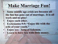
Despite having performed before millions of people in his life, Byrne shuffled nervously behind the podium, stepping from side to side in scuffed white saddle shoes. With his slender build and crest of silver hair, he seemed birdlike, an impression only heightened by his darting eyes and bobbing head movements. He rarely smiled as he clicked through several examples of unintentionally hilarious PowerPoint slides that he found on the Web, such as these:
 |
 |
He joked about how when he began playing with PowerPoint, he didn't know about its unwritten rules - that everything should have bullet points - and said he was fascinated by the Autocontent Wizard. "If you don't know what to say, if you don't have content, it'll help you out," he said mischievously, showing a slide about how to deliver bad news:
Our situation
• State the bad news
• Be clear, don't try to obscure the situation
Make it up as we go along
But bad PowerPoint presentations, such as the ones the audience were chortling over, are the fault of the presenter, not the software, Byrne said. "There's a lot of criticism of PowerPoint" - for encouraging users to do things in a particular way and discouraging them from other things, such as putting more than seven bullet points on a slide, he acknowledged. "But if you can't edit it down to seven, maybe you should think about talking about something else." PowerPoint restricts users no more than any other communication platform, he asserted, including a pencil: "When you pick up a pencil you know what you're getting - you don't think, 'I wish this could write in a million colors.'"
What bothers PowerPoint critics, most prominent among them the information-design guru Edward Tufte, is that the software seems to circumvent creativity, to elevate clip art and gaudy graphics to the status of actual substance. But while acknowledging the general trend toward such vacuity, Bryne said "you can't blame it on PowerPoint. .You see it on the TV news, everything's filled with graphics and icons - it has the illusion of content but there's very little being communicated."
What Tufte and other critics are missing, he said, was that PowerPoint was just one element of the presentation. He invoked the influential media commentator Marshall McLuhan, author of "The Medium is the Massage," to counter Tufte's reductivism. Only the worst presenters stick to reading what's on their slides; most ad-lib and engage with the audience both verbally and nonverbally. "Sixty to 90 percent of the communication we receive is nonverbal," said Byrne. He waited a beat. "That's more than half!"
| PowerPoint's history Bob Gaskins, a former Berkeley Ph.D. student, conceived PowerPoint originally as an easy-to-use presentation program. He hired a software developer, Dennis Austin, in 1984 to build a prototype program that they called "Presenter," later changing the name to PowerPoint for trademark reasons. PowerPoint 1.0 was released in 1987 for the Apple Macintosh platform; later that year Gaskins's company Forethought and the program were purchased by Microsoft for $14 million. The first Windows and DOS versions of PowerPoint followed in 1988. PowerPoint became a standard part of the Microsoft Office suite in 1990. According to Microsoft, more than 30 million presentations are made around the world with PowerPoint every day. |
I guess we must be having fun
Ultimately, Byrne said, he just enjoyed playing with the program, and continues to do so. "I made a presentation recently that was just colored slides fading in and out, like a rainbow. I put this gospel music to it - it was this wonderful, uplifting celebration," he said. "Who knew? Sometimes you only find out what's in there when you take everything out."
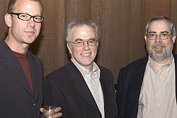
 UC Berkeley engineering professor Ken Goldberg, the event's host, with PowerPoint creators Dennis Austin and Bob Gaskins. |
Gaskins pointed out that a lot of the humorous ways people were using PowerPoint were not in fact new. The very first version came with a sample presentation by Christopher Columbus, with bullet points illustrating why Queen Isabella of Spain should fund his voyage. "So while I think the Gettysburg Address presentation is really funny, it's not new," he said.
Ultimately, PowerPoint is just an instrument like a guitar, with ones and zeroes in place of strings and wood. And as Byrne showed last night, perhaps the naïve melodies are best.

