

Berkeleyan
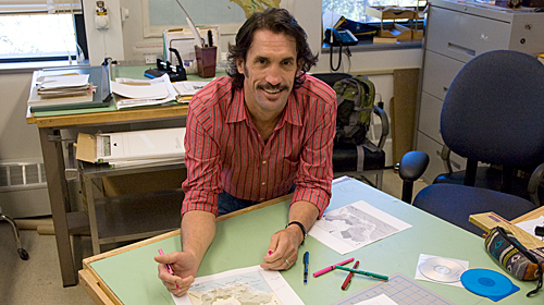 |
Darin Jensen maps out the pleasures of engaging in and teaching students about cartography. (Wendy Edelstein photo) |
It's My Job
21 August 2008
 |
The Berkeleyan regularly showcases staff members whose work is essential to the smooth functioning of the campus. Do you know someone whose job would interest readers? Send an e-mail with your suggestions to berkeleyan@berkeley.edu.
Darin Jensen
Staff cartographer and geography lecturer
![]()
What does your job entail?
I create maps for all of our facultys printed publications and teaching aids. I also teach Geography 183, Cartographic Representation.
What do you like best about your work?
I like being able to work in a field that I really love, and having the opportunity to help other people appreciate it and learn how to do it.
What do you think about before you begin drawing a map?
Whats the best way to display the information so that it is understandable by the widest possible audience? Its important to consider the end-user. We have to approach cartographically treated map documents like any other graphic art.
Isnt mapmaking just an accurate geographic representation?
Not unless youre talking about photomaps. Mapmaking relies on the language of graphics, and incorporates symbols, icons, and color. Because these elements do not have rigid meanings, cartographers use what we know about the people who will use our maps to make intuitive choices in our graphic representations.
What do you teach students of cartography?
Theres the vocational aspect the mechanics of making a map including learning the software, and accessing the databases or the source materials from which to trace maps.
Also, there are cartographic conventions.
Such as?
Students who take my class will never forget that when they put the name of a water body on a map, it must be in italic type. Color theory plays a big part in cartography, and how color works to make a map readable or not.
How does color theory apply to cartography?
We talk about how we shouldnt let stereotypes guide us in color decisions. For instance, we would never represent Indian lands in the Americas with red fills or the Asian continents with yellow. We need to talk about these things, because the main tenet of a well-drawn map is that it speaks to the widest possible audience.
It sounds like you have an agenda of sorts.
If I have a mission in teaching cartography, its to get away from those old ways of thinking. I have a whole lecture called North Is Not Up. The planet does not have an upright orientation in any direction, though you wouldnt know that to look at most maps. We have to be respectful of convention so that the maps are readable, so that a map looks like a map, but should North America always be at the top of the page? I dont think so.